
MY PROCESS: How I create my artwork
[Enter your text here.]
Content coming soon!

MY PROCESS: How I create my art
There really never is one way to create art so this doesn't really cover everything but in the past I have been asked by people to pull the curtains aside and show them how I do what I do. It is especially important to show this these days, unfortunately, due to the computer age where things can be done with the click of a few keys on your keyboard. While I am often lopped into the "digital artist" club of professional commercial artists I think it is always important to show your process and remind people that while I certainly use digital painting to get my results, I started drawing from the age of 5 in 1981 and that I didn't use the computer to create artwork until I was 32 in 2008. For the first 30 years of my training as an artist I spent 95% of that time drawing. Drawing is what I love to do and what I do best. My idea of art is sitting down with a pencil or pen and drawing. I was never much of a "color" guy or a painter. In fact I never really painted until I took an oil painting class in college.
All of my work, prior to 2008 was strictly black and white ink drawings on paper. The first time I used photoshop was to letter my comic books and the first time I started using photoshop to color my work was when I first got published with HorrorHound Magazine. Up until then when I needed color I used watercolors on my work. The first thing HH printed of mine was a fan art contest piece in Issue #3. The piece is watercolored. I was just not happy with the way the computer scanned in my watercolors and when the magazine decided to give me a job I realized I needed to have a cleaner look to my coloring. I was a comic book artist but only printed black and white because color was expensive but these days when they color comics they do it digitally. So I tried to figure out how to use photoshop to color. I skimmed through a Photoshop for Dummies book one afternoon and just played with it. I'm kind of lazy when it comes to this stuff so basically I use the basics. In fact I still use Photoshop Elements 5.0 to do all of my work because I know how to use it even though a friend gifted me the high end photoshop--I only use it to make my original ink drawings a layer and I do all of the painting in elements. I also use a mouse.
But enough about defending photoshop and digital artwork. Photoshop and other computer software are just new tools for the new age and are very helpful but should never be used as a crutch or as a primary source of making your art. So lets get started on an example of my process.
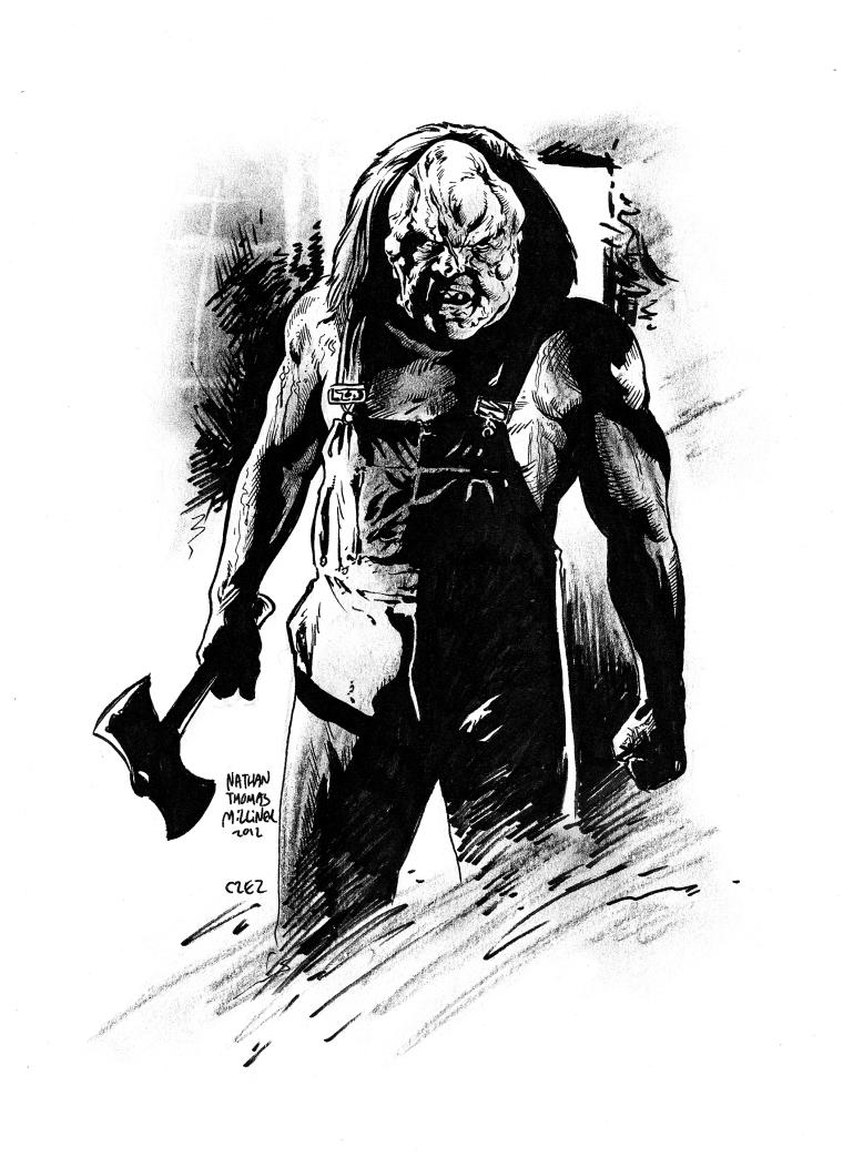
Click on the picture to the left to enlarge. This was a pen and ink drawing I did as a gift to director Adam Green of his character Victor Crowley from his film series "Hatchet". I work almost exclusively on 8.5X11 cardstock paper using pencils and micron pens to ink my work. To add tone I grabbed a piece of chalk and added shading to this ink drawing. This is basically how I worked for the first 30 years of my life as an artist. I love inking and drawing. Coloring is a necessity in commercial art but if I had my way this is how I would work all of the time. When I was a kid and I would look through an artbook of someone like Frazetta, the paintings were nice but I always turned to the drawings. Salvador Dali called drawing the truest artform as a painting can be cheated but you can't cheat a drawing. You put the line down and it is there permanately and it is either good or bad.
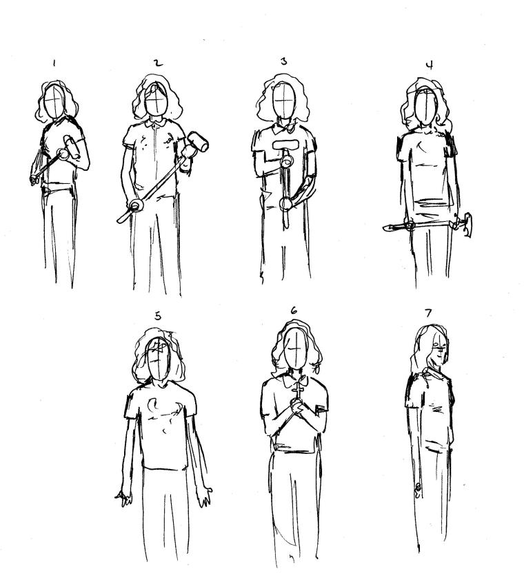
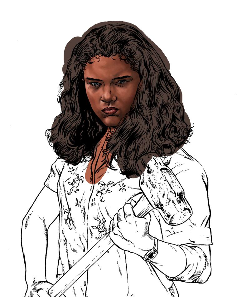
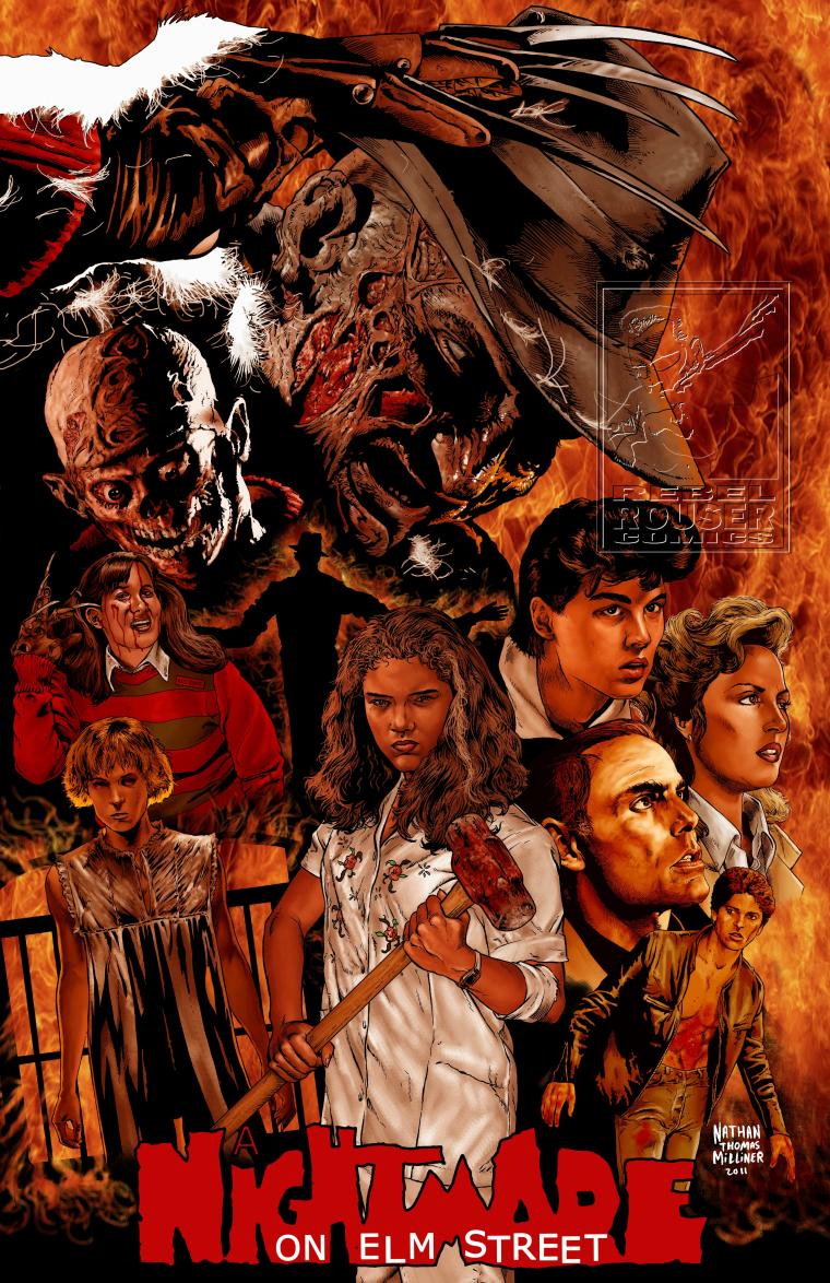
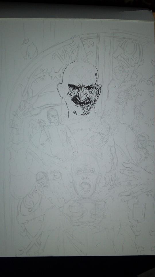
Everything starts out with the thumbnail sketch. This pretty much started for me once I got into comic book art. An artist first starts out laying out the page in small thumnail sketches. The picture to the left isn't a comic book page thumbnail but is part of me explaining the process that I use about 75% of the time when I make my artwork. The example I used a few years back on my facebook page was for "A Nightmare On Elm Street" poster I wanted to create for Robert Englund when I met him. The last element to the poster was Nancy (Heather Langenkamp). I grew up believing that artists always drew from their imaginations and that was how I worked for pretty much the first 25 years of my art career. Then I learned that the reason all of my favorite artists were able to capture such reality was because they used photo references. In the picture to the left (click to enlarge) we have several thumbnail sketches of Nancy in her pjs. I wanted an original picture of Nancy that I could not find from the film. I knew a cosplayer named Dianna who looked a lot like Heather so I sent her these sketches and had her take photos of her in the poses. Thumbnails are fast and lacking any detail.
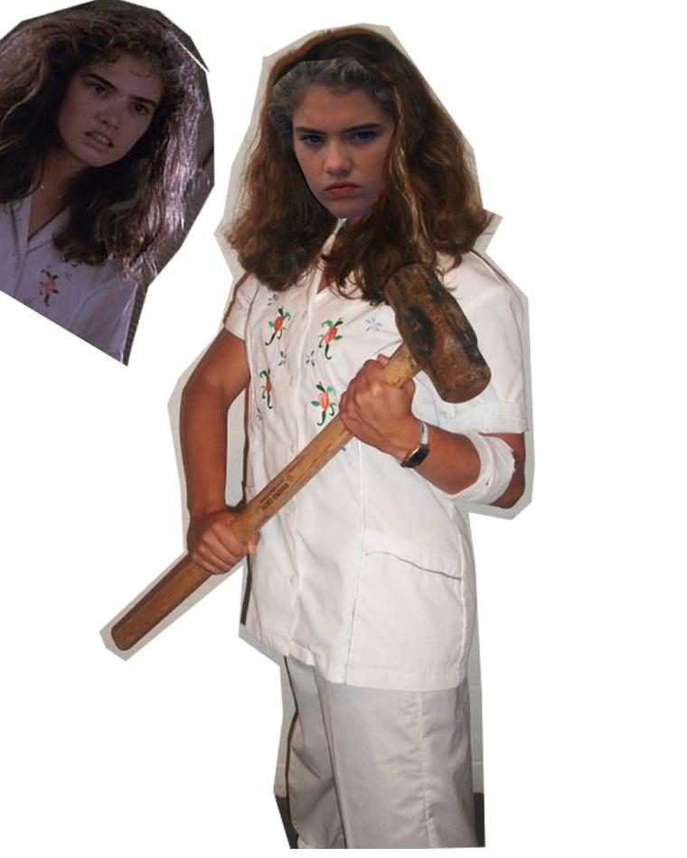
Dianna had her father take photos of her in the various poses I had thumbnailed and sent them over. Out of them I chose the best one for the piece. I wanted to capture Nancy as she was intended in the film--as a dominate, strong figure. Wes Craven had been ragged by his daughters for always making the female leads helpless in his films so he decided to make his leading lady in Nightmare a fighter. This was the photo of "D" I chose and then I found a photo of Heather from the film to use as the reference for her face.
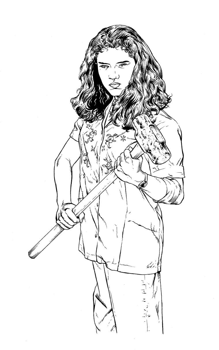
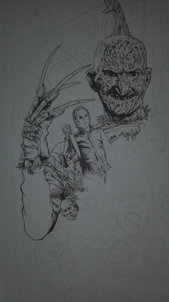
In the early 2000s an artist named Tim Bradstreet started doing covers for comic books and they were basically the look I had wanted my entire life. Very beautiful black and white drawings that captured reality and were very gritty and just plain cool. My first thought was--wow, how is this guy THIS GOOD? Again, I grew up thinking people drew everything from their imagination. Then I realized that not only did Tim, and many of my other heroes like Drew Struzan and Norman Rockwell not only used photo references to get that reality but they actually blew up and traced the photos. My first thought was: "That's cheating!" But then I realized that tracing a photo is not exactly "simple" when you see the results that these artists achieved. It still takes an artistic eye and sense to pull it off so well. It is about knowing HOW to interpret it and what marks to lay down and which not to lay down. There are dozens of Bradstreet copycats but none of them are as good at it which is because it is MORE than tracing. Bradstreet KNOWS how to draw--he put in the hard work through his childhood and young adulthood. It is important that one not rely on lightboxing to draw. I often will not use this process just to assure myself that I don't need it. It is important to have the confidence that if someone asked you to draw something without a photo or a reference that you can do it. I do this at conventions all of the time not only for the commissions but to show in public that I can draw regardless of the process I am using and need only my pen and imagination. As I tell people, I drew for 30 years without a photo, lightbox or photoshop. Bradstreet will spend hours tracing a photo--I don't and would not do that. My time at the lightbox is very short as quick as I don't want to "cheat" and have every line I will draw in the inking process already down in pencil. Even before lightboxes and photos I always had light pencils as I enjoy the drama of going straight to ink and seeing the piece appear before me without a net to protect me if I make a mistake. So this image to the left is the inked version of my drawing. It is then scanned into Photoshop.
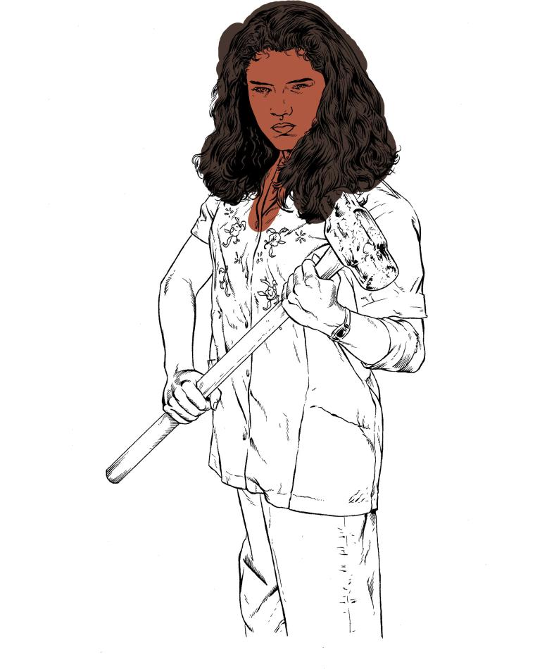
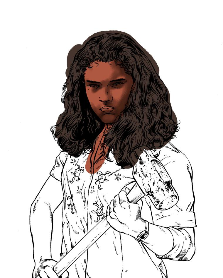
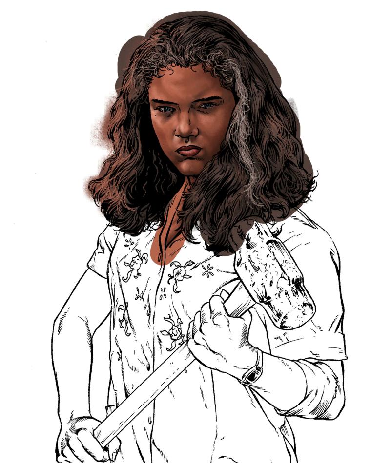
Once I have made the black ink drawing a layer I open it up in Photoshop Elements 5.0 and I started painting behind the artwork. I first lay down solid colors as seen at the left (click to enlarge). I basically paint as real painters do, building up colors and smoothing them out. As I mentioned earlier I still use a mouse to color. I tried the pen but couldn't get used to using it. I stick with what works. The primary brush I use is 65 faux brush. I'd say 90% of the painting is done using this single brush. I have very little knowledge with photoshop so I stick with what works for me and keep it basic. I think this is the reason I get the results I get. I held off using photoshop for so long because most of the photoshop art I saw was terrible. I hated the look of it because it all looked like blurry messes. I mean I really didn't like the look and I think it is because a lot of digital artists overuse the effects and blurs and such and I stay away from all of that. I never use effects or filters on these types of pieces. It is a question of control. Using a filter to me takes the control away from me--I like to control EACH mark and stroke. It has a lot to do with pride as well. People frown on digital art. Some naysayers out there go so far to say that all of my work is photoshopped photographs with filters added. Basically saying nothing I do is actually drawn but phony. This robs me of all of the hard work I have done over the last three decades to be able to do what I do. If I could find another way to do the color as fast and as easy as photoshop (as a commercial artist time is a factor and lightboxes and digital painting are great tools to speed things up to meet deadlines.) But I would NEVER use filtered photographs as artwork. Those who do I have very little admiration for. I resort to taking it as a compliment when I am accused of filtering a photo because I know they were hand drawn with hours of inking and digital painting as any normal painting would need and if they think it is just a photo then I have achieved my goal to make it look realistic.
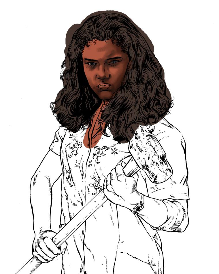
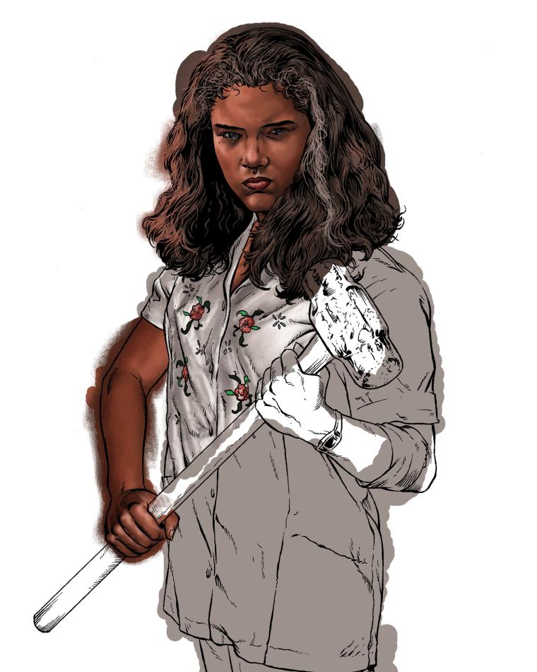
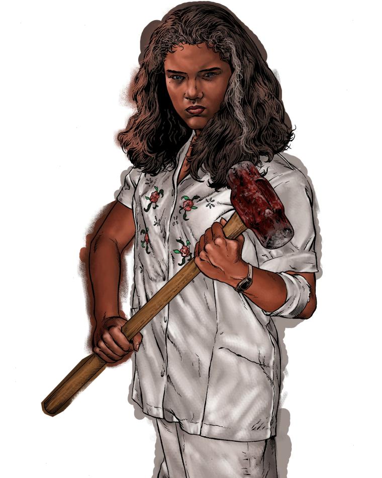
Once Nancy is completed she is pulled over into the finished artwork. I used to draw everything on the same piece of paper which caused headaches for my editor at HorrorHound Magazine. After the 20th issue cover of the magazine in 2009 I changed the way I worked. It is kind of a bummer but it makes commercial artwork so much more convienient. I was doing a poster for HorrorHound #20 that featured 60 icons of horror of the 2000s. It was all drawn on one single piece of paper. Once finished, the editor decided to make the poster the cover of the issue but the poster was 11X17 and horizontal. The cover needed to be vertical and he could only use one half of the art. He wanted to have characters from both sides of the poster on the cover but had to cut and paste and work hard to do this. Had I drawn each character individually and made them layers, he could have done the same job in a quarter of the time. So from that day on I have done all of the elements of my art in layers. I draw each character on a seperate page (sometimes there may be multiples on a page). Anyone who comes to my shows can flip through my binder full of drawings and see what I mean. Then everything is put together and if I need to move something, make something a different size then it can be done. The only art I do these days as a whole are my comics and my Monsters and Madmen pieces--they are all done on the same piece of paper and not layered. It also comes in handy with Scream! Factory. Scream! releases their films on both dvd and blu ray and the covers for these two formats are different. The dvd cover is tall while the blu ray is basically a square. To fit the space I often have to send Scream! two versions of my covers (one to fit each format). Layering is the only way to make it possible to make quick changes when needed. Even my signature is a layer as sometimes it may need to be shrunk down, removed or made a different color so it isn't so LOUD...
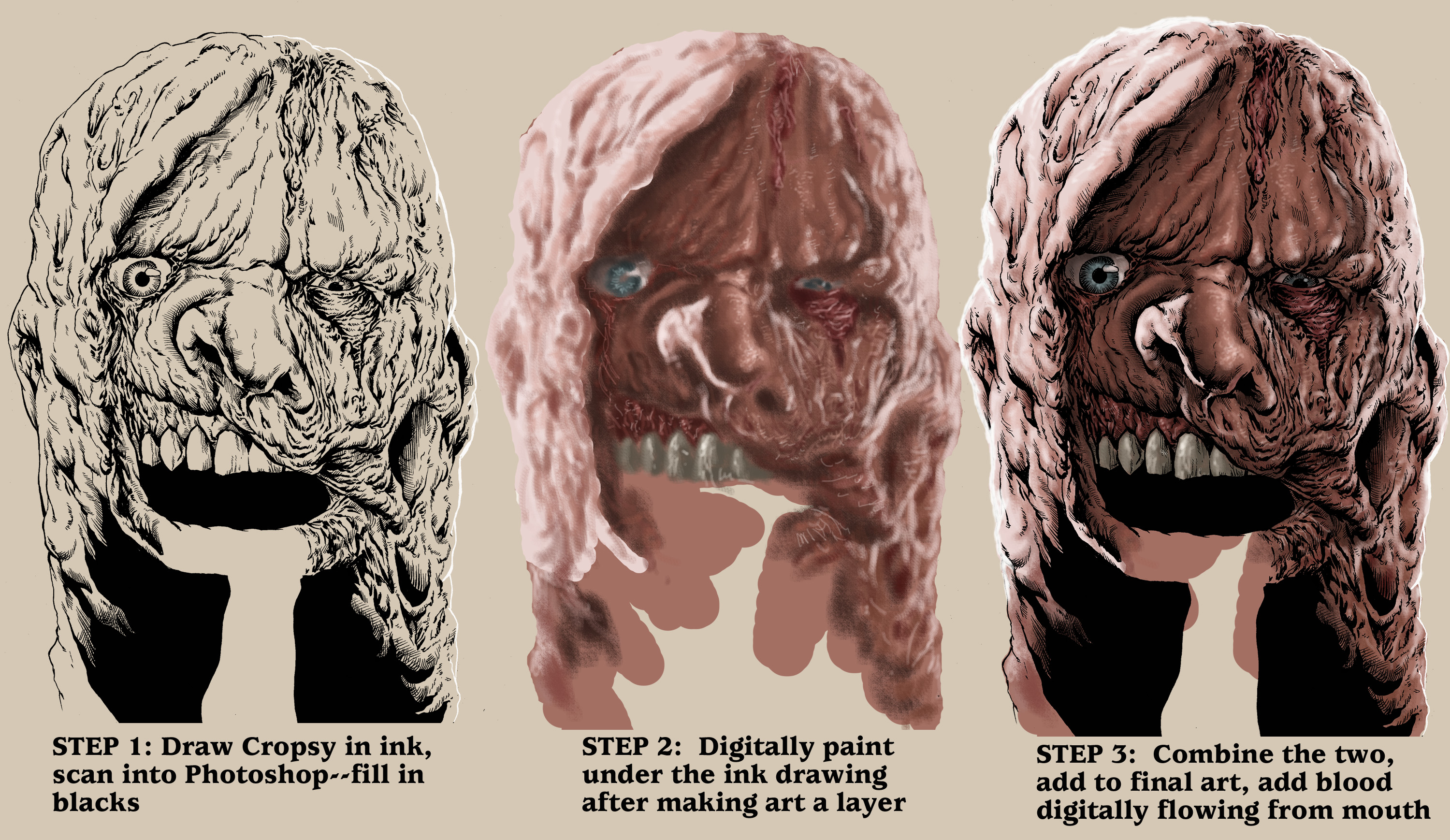
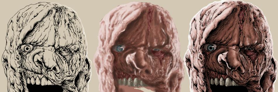
Above is an example of my process WITHOUT photo lightboxing. This is the image of Cropsy from my artwork for the blu ray release of THE BURNING from Scream Factory. I did have photographs of Cropsy from the film and a few fan made mask replicas I found online but the design I wanted was an homage to Dawn of the Dead so I needed a certain angle and look so I drew this image of Cropsy from my imagination. It started with the ink drawing--next you can see the underpainting and at last you can see the two layers combined.
As I said a few times, in commercial art, time is always a factor so this drawing is uncomplete because blood was going to be pouring out of his mouth so I knew I didn't need to waste my time drawing his bottom lip or chin. To see the final artwork just check out my Scream! Factory page.
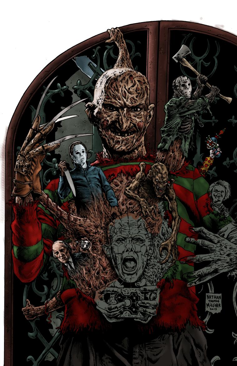
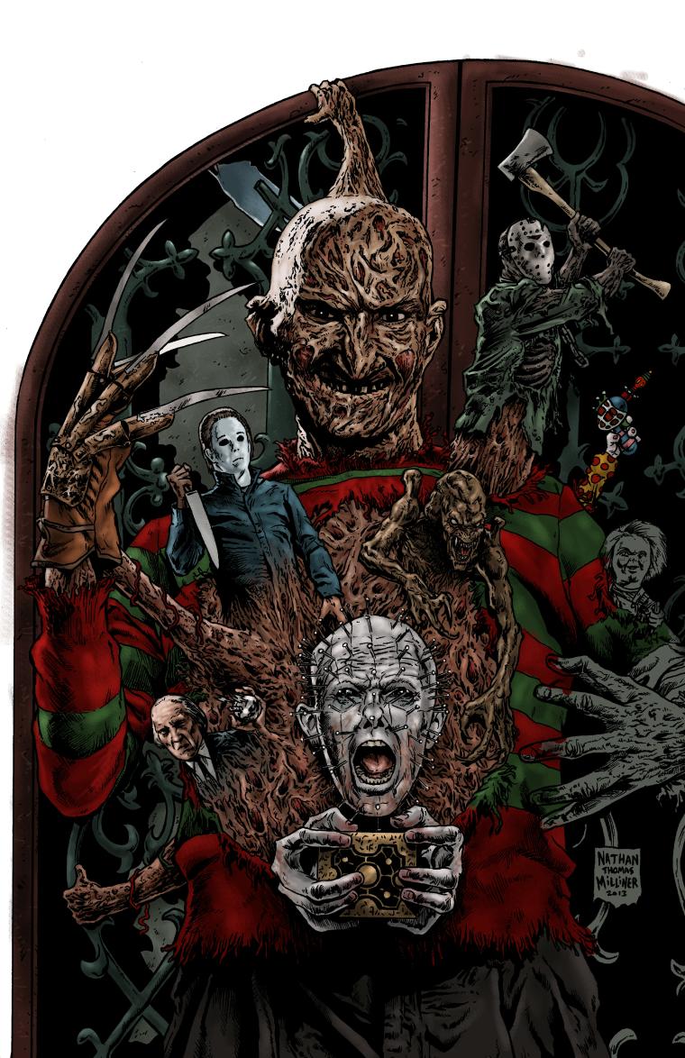
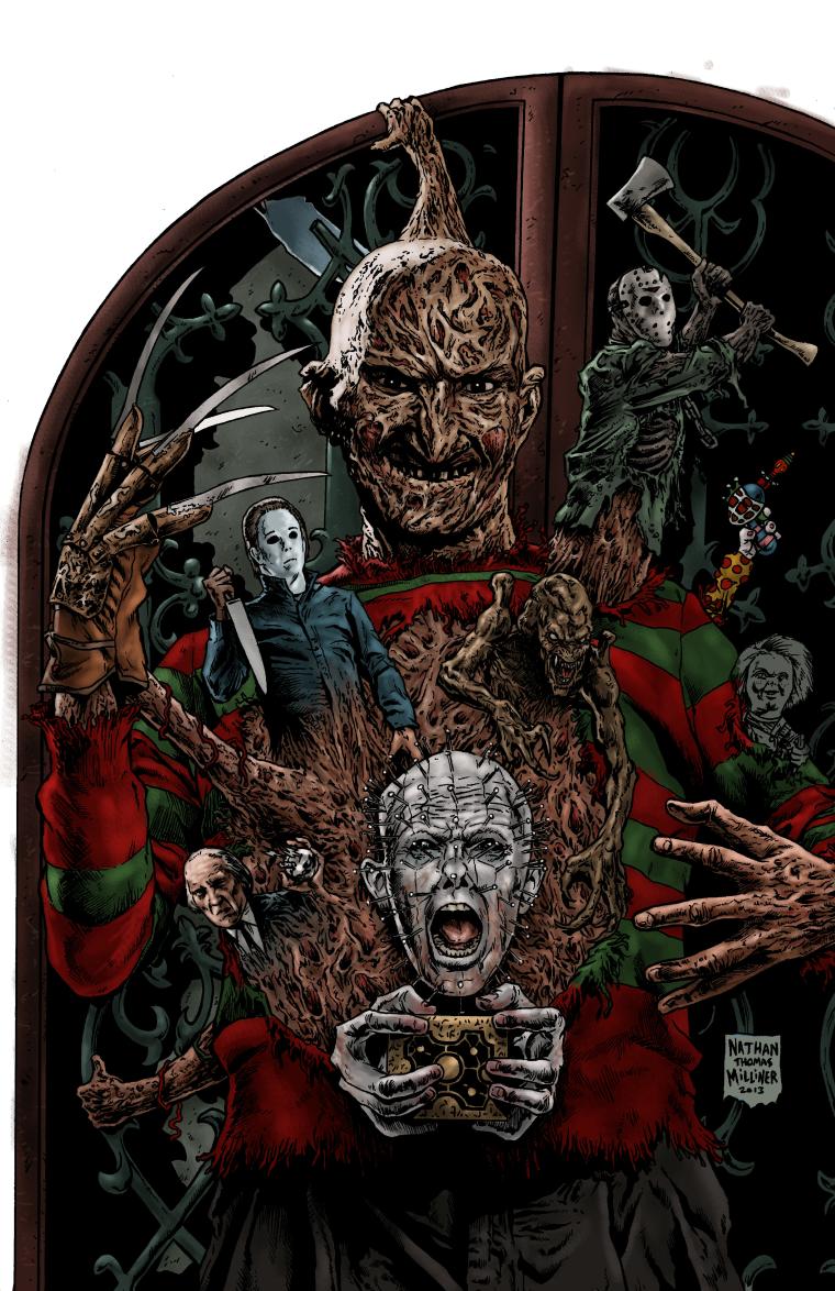
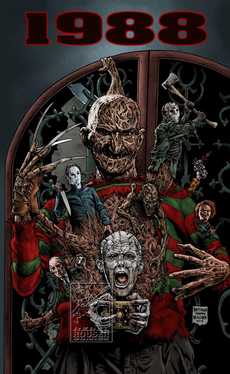
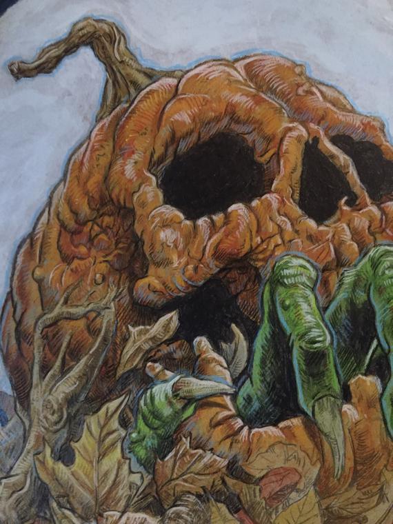
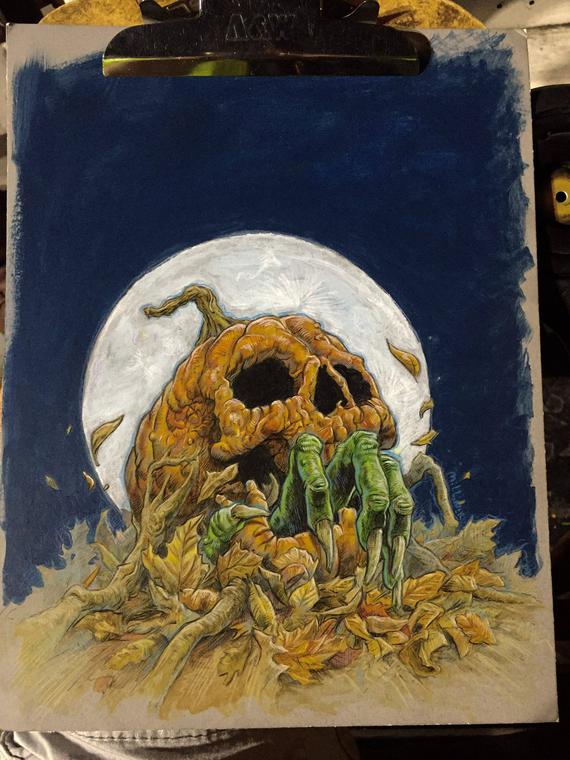
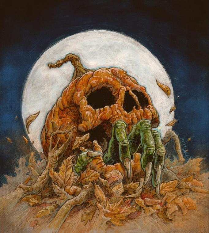
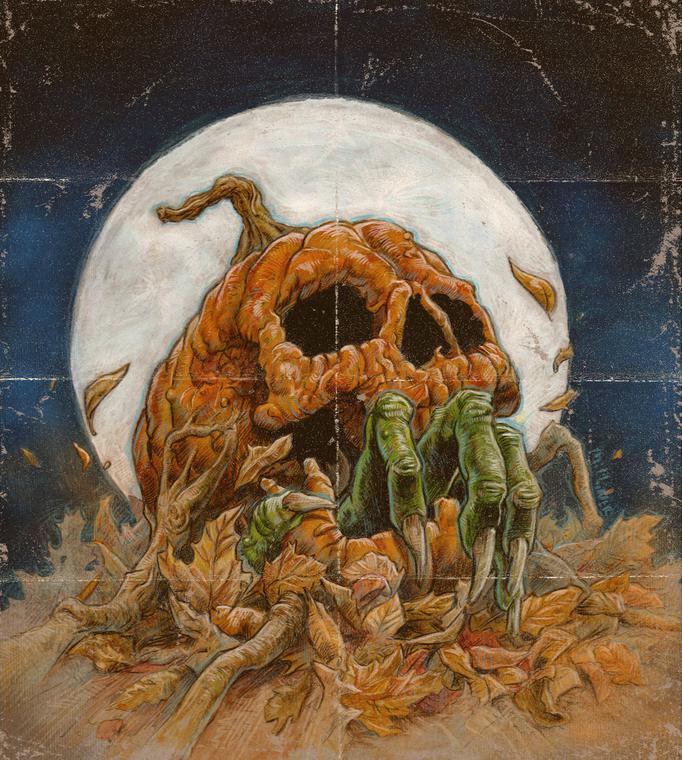
1988 ARTWORK PROGRESS GALLERY--FROM PENCILS TO INK TO COLOR

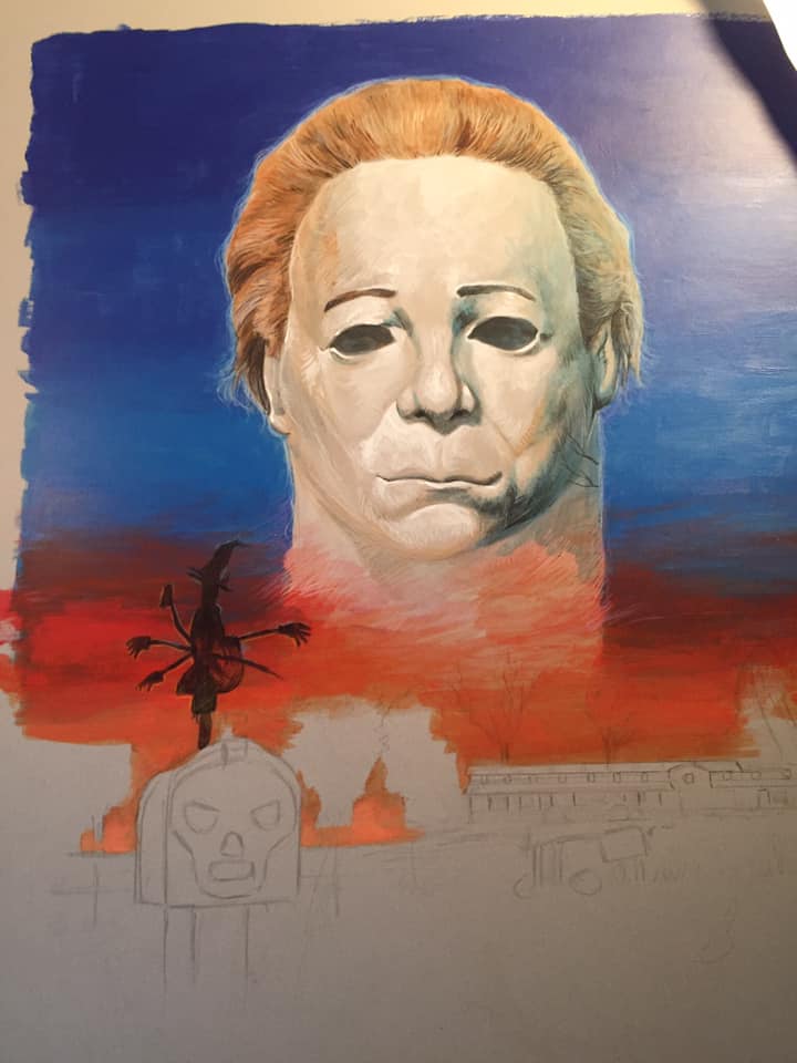
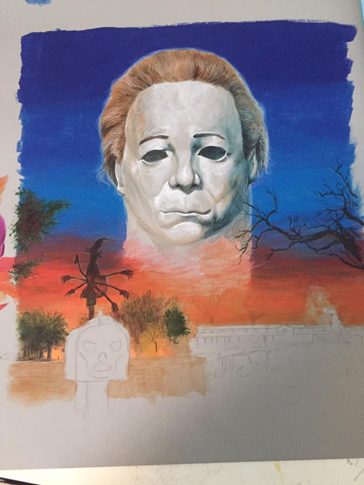
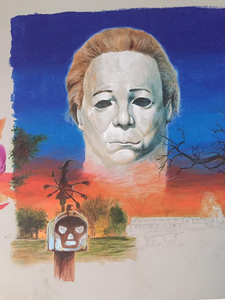
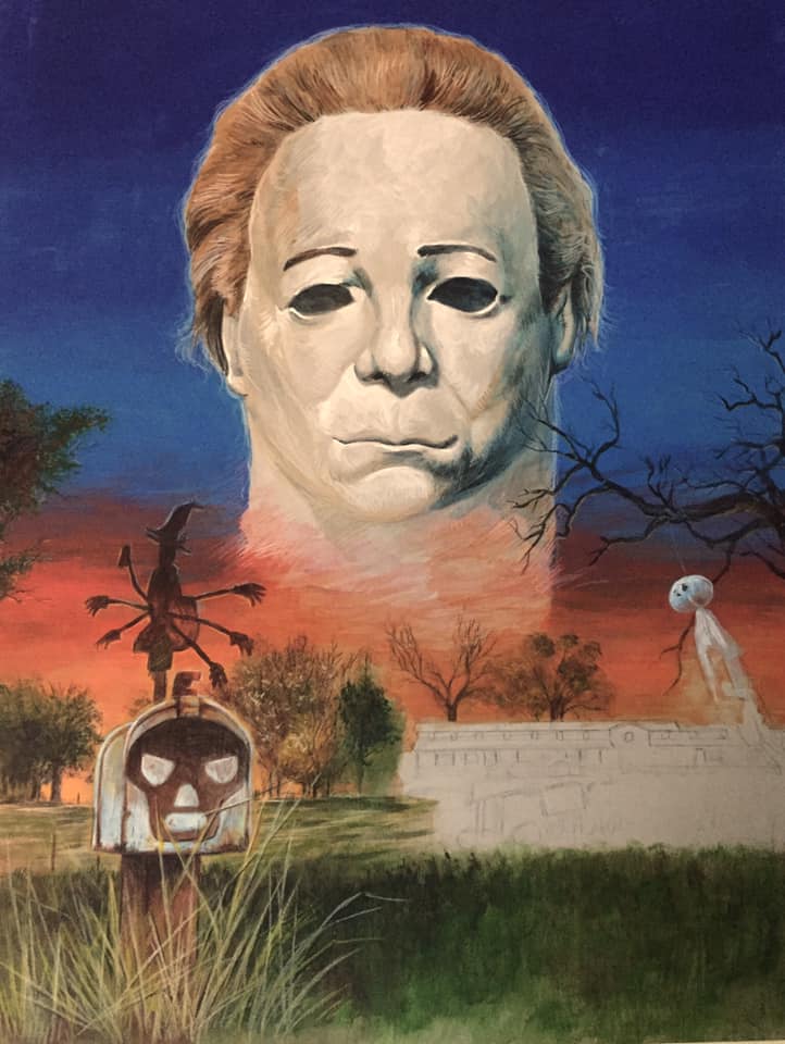
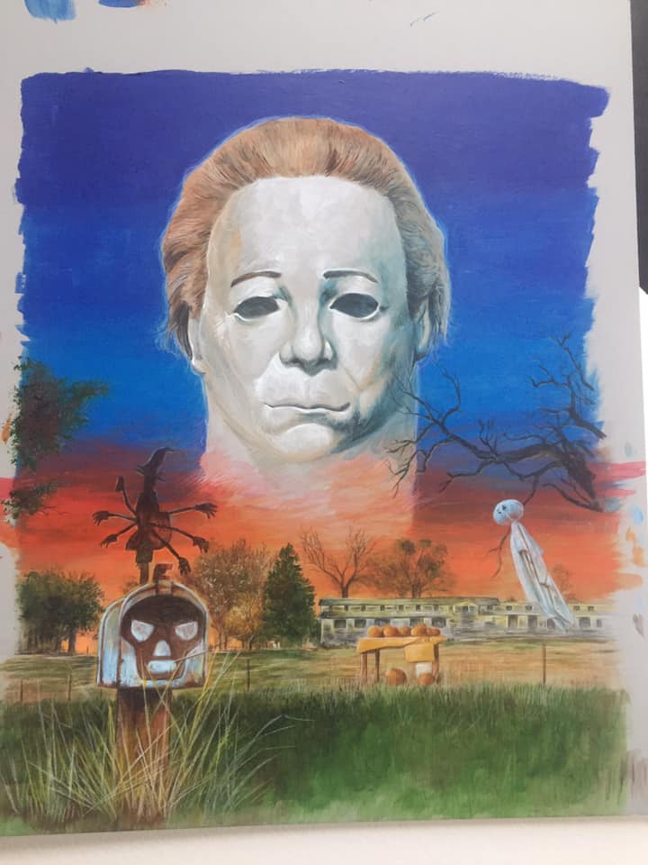
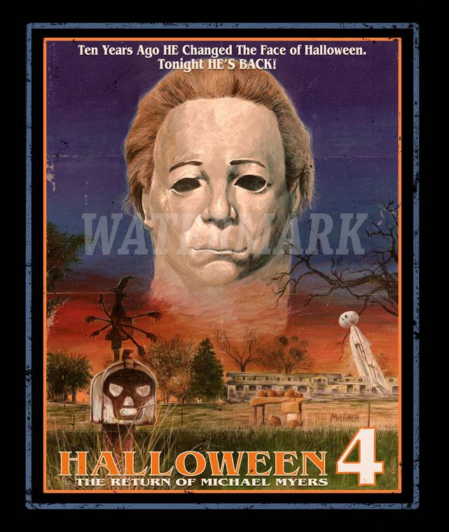
FRIGHT RAGS HALLOWEEN 4 TEE-SHIRT
A tee-shirt I did for Fright Rags in 2018. Watercolor and pencil on illustrator board.
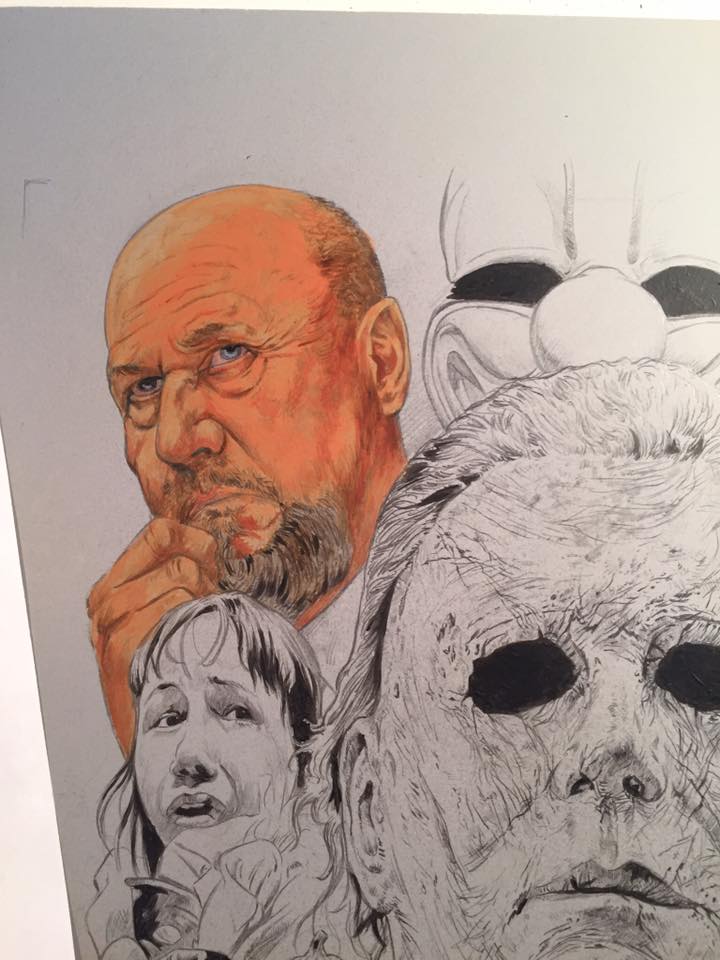
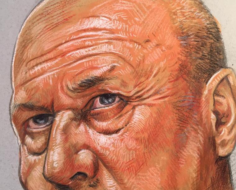
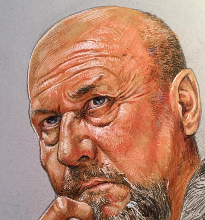
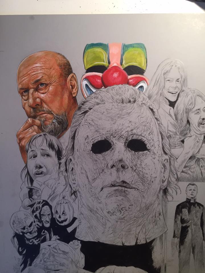
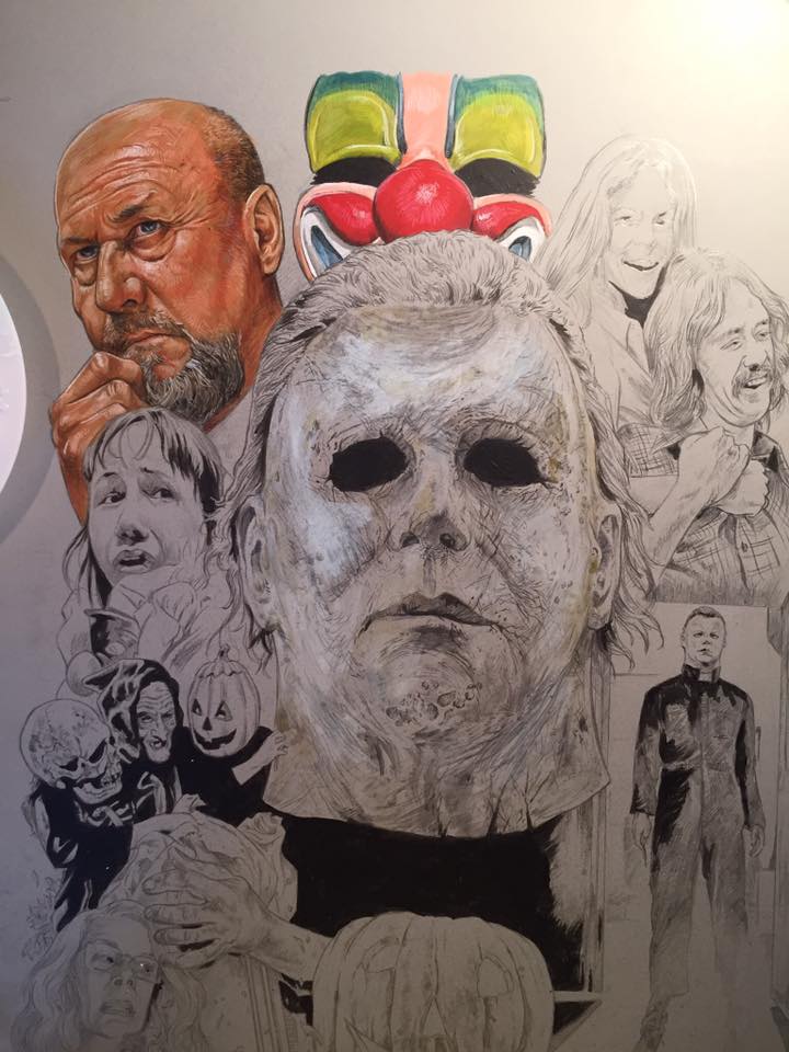
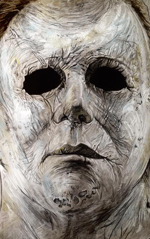
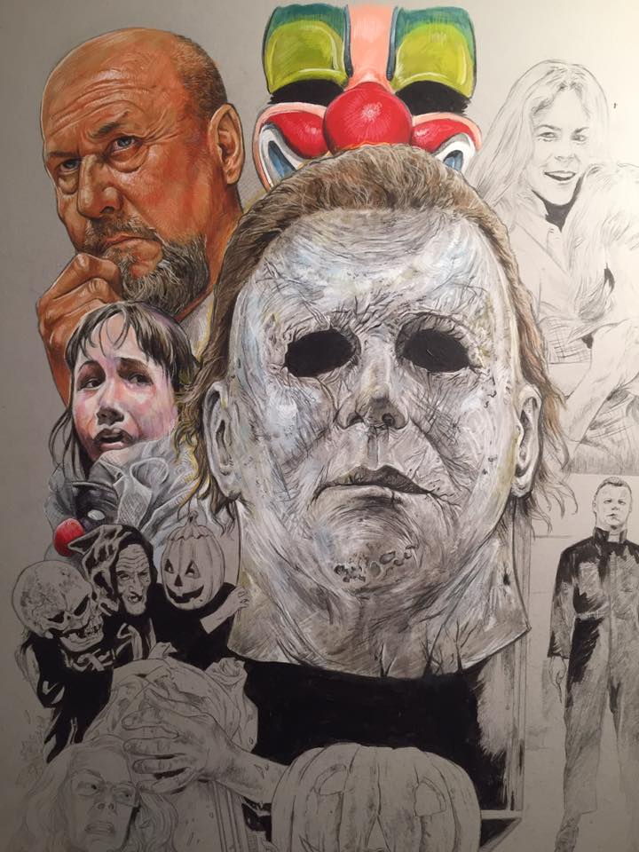
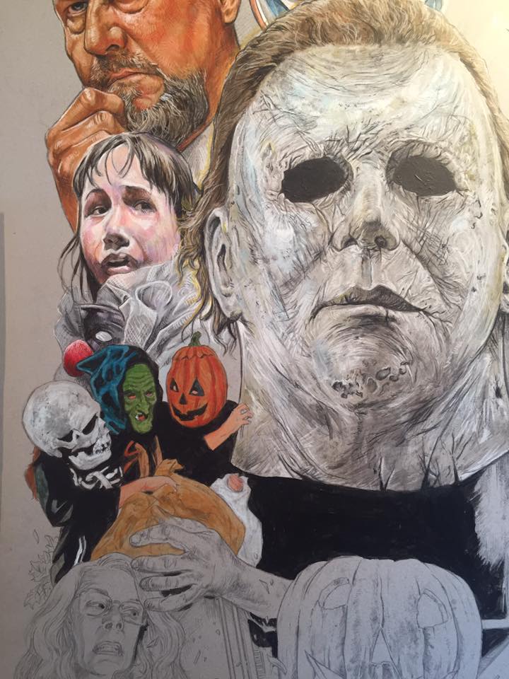
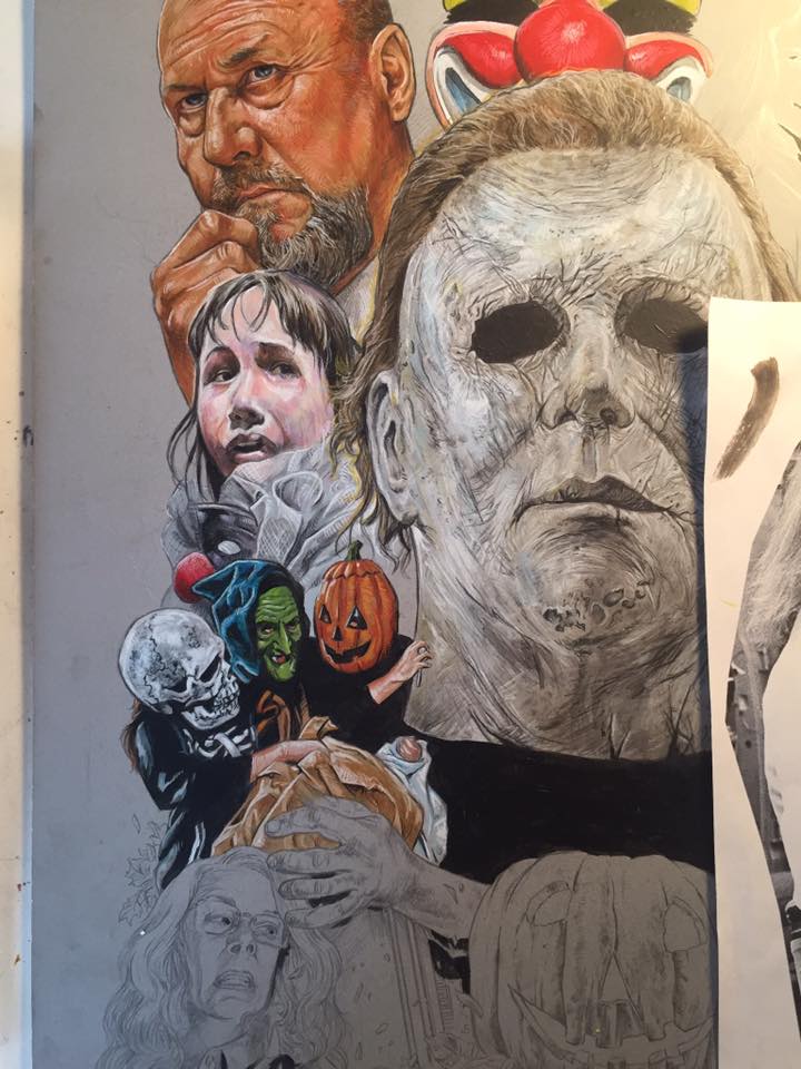
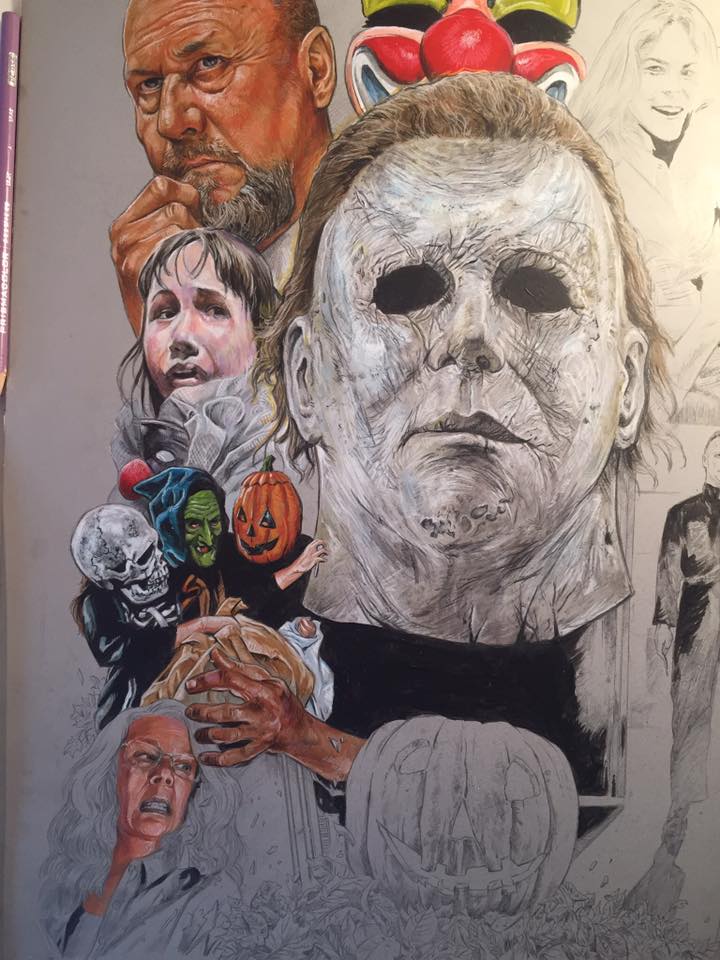
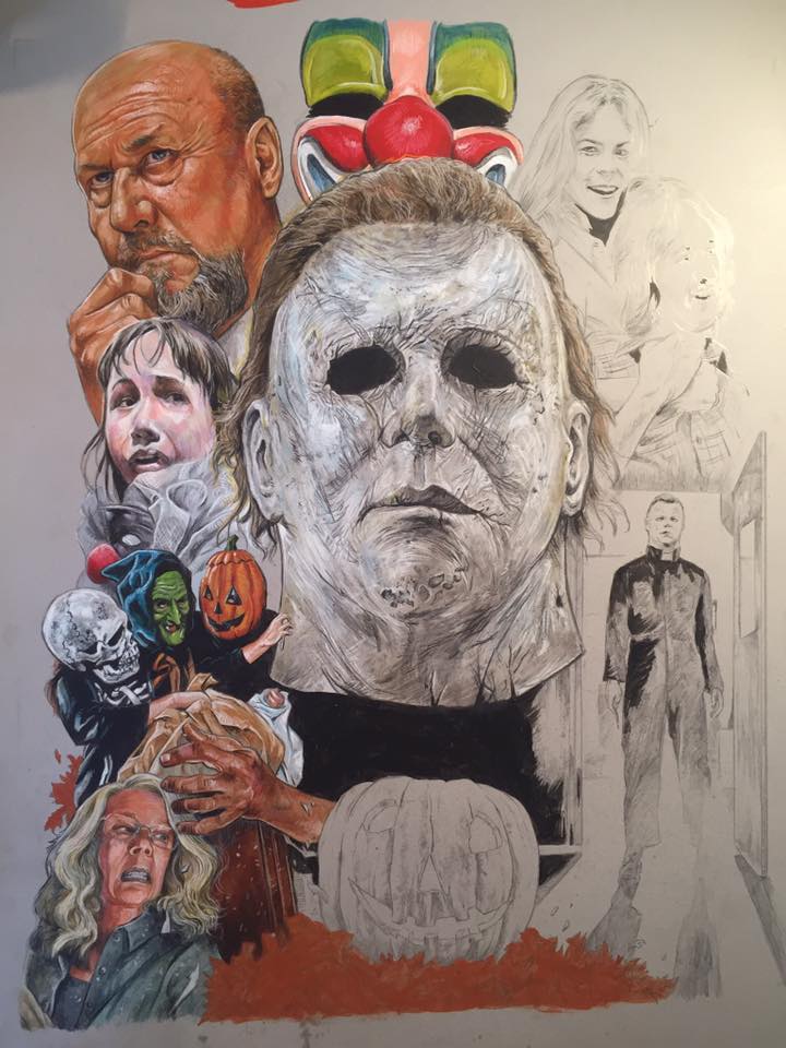
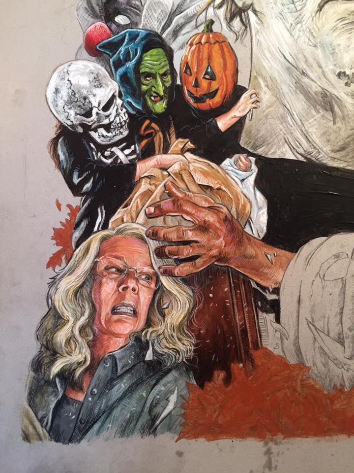
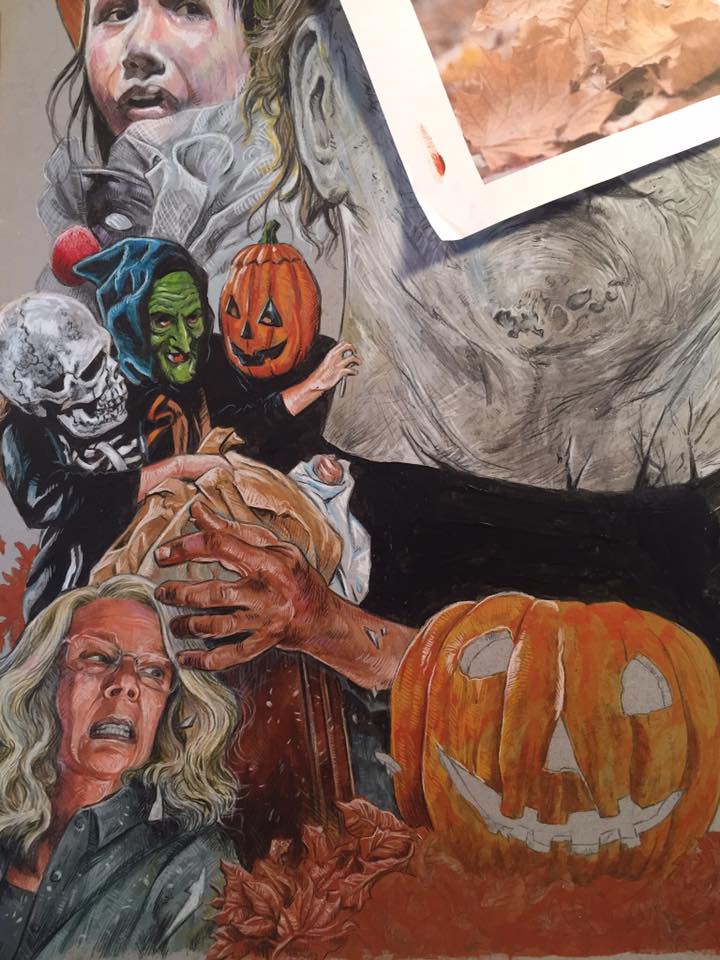
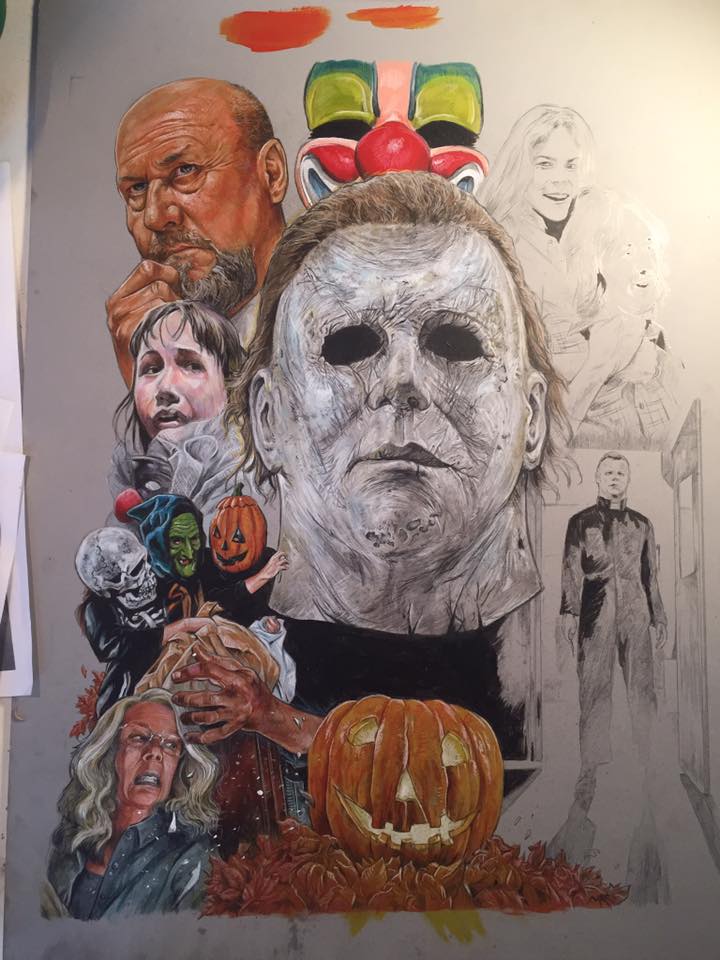
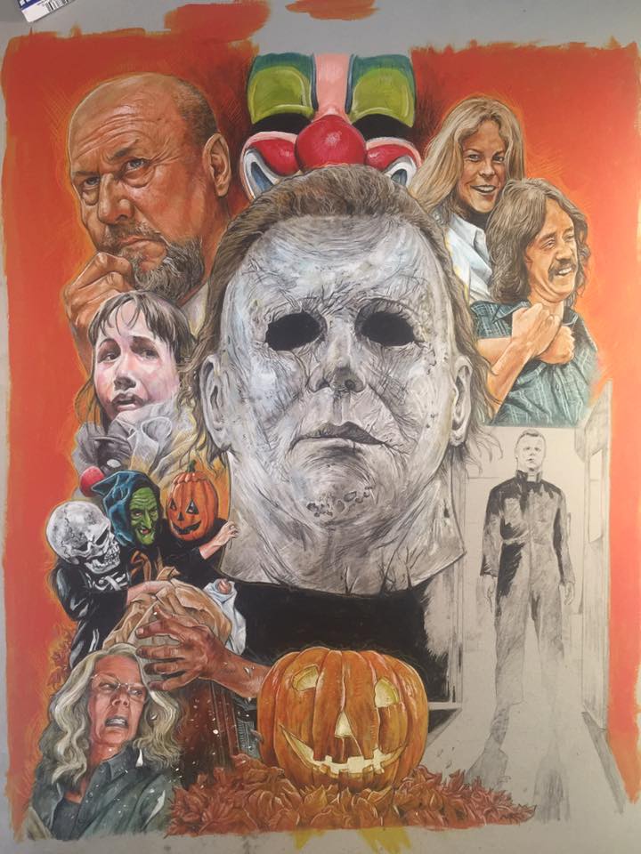
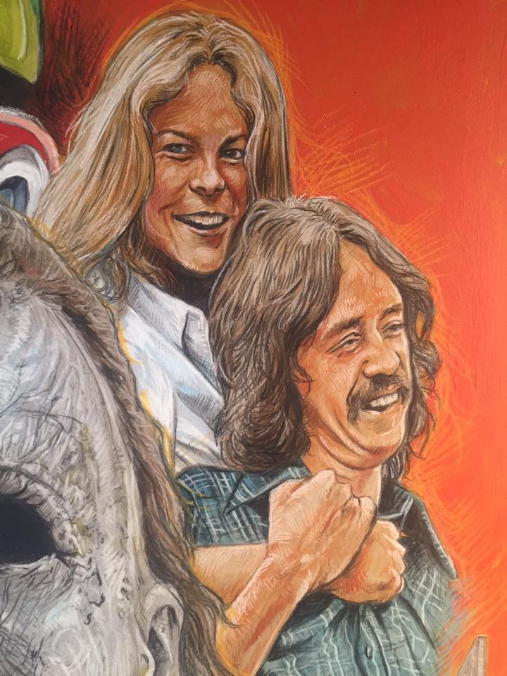
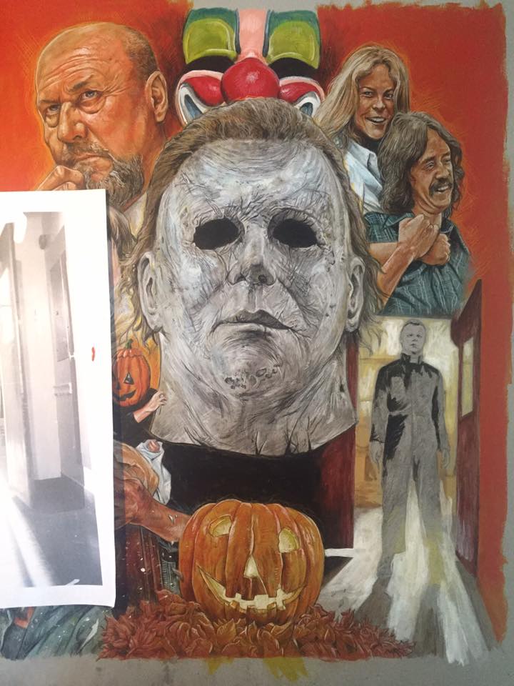
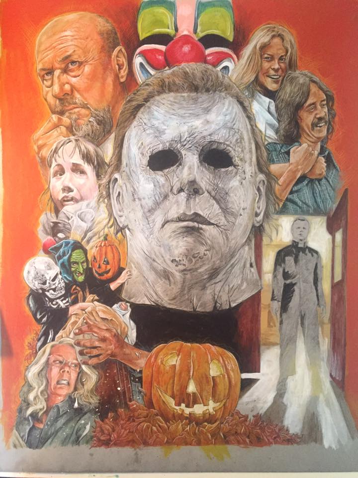
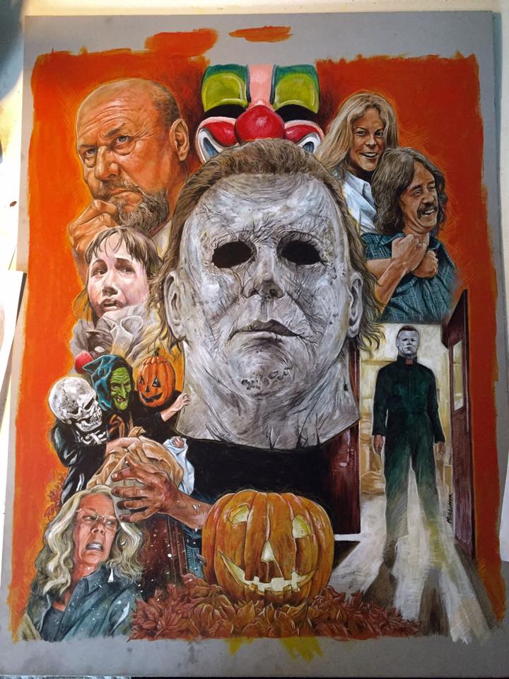
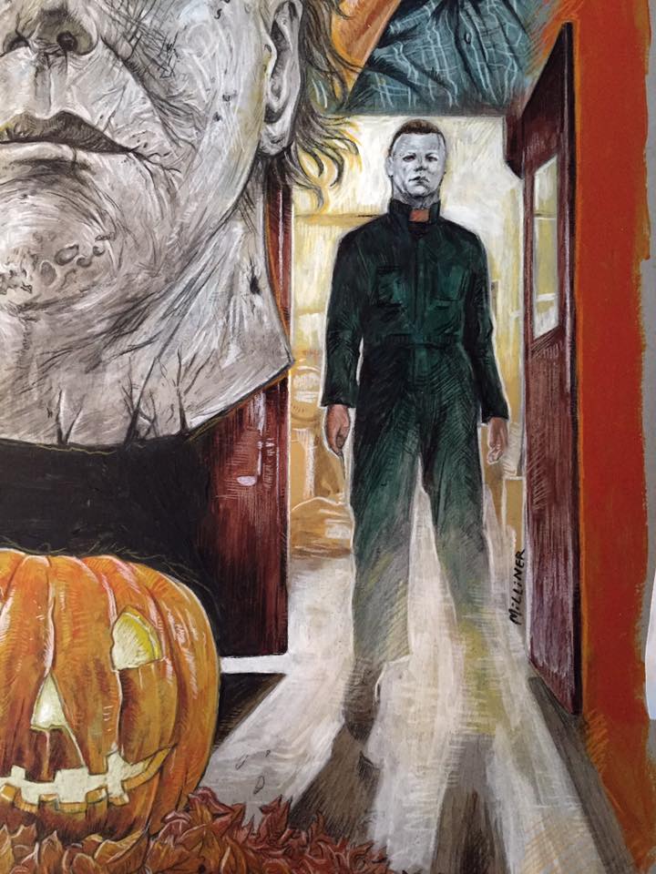
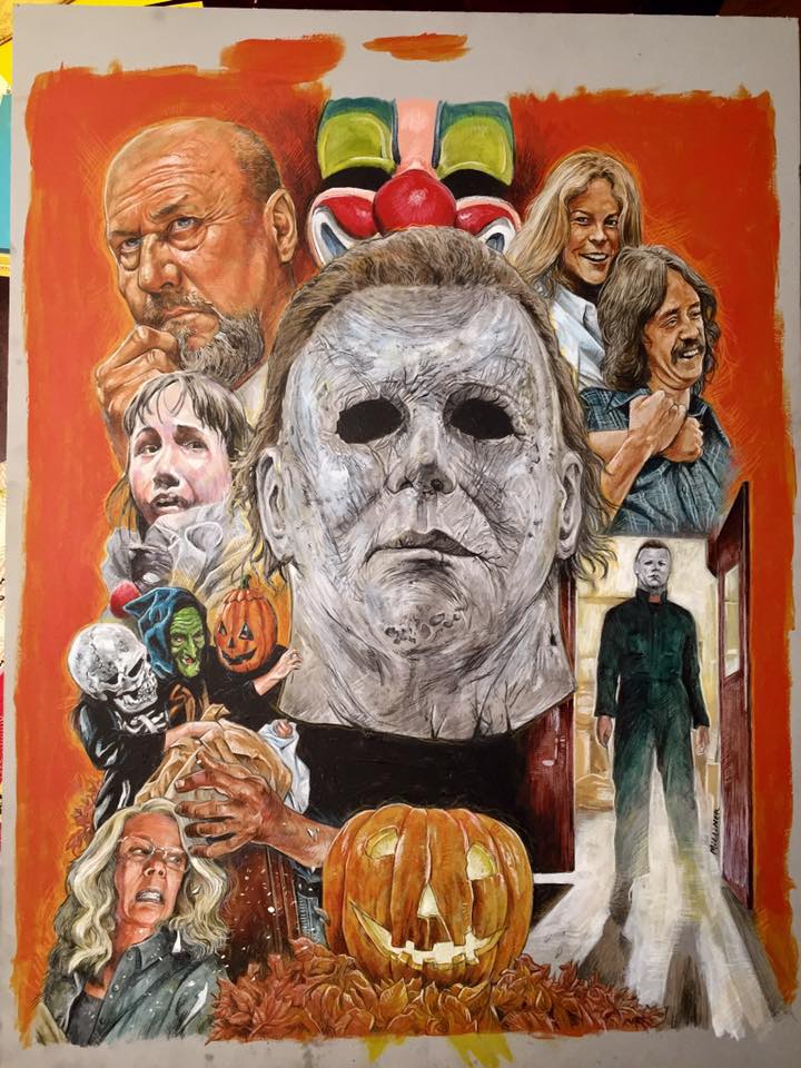
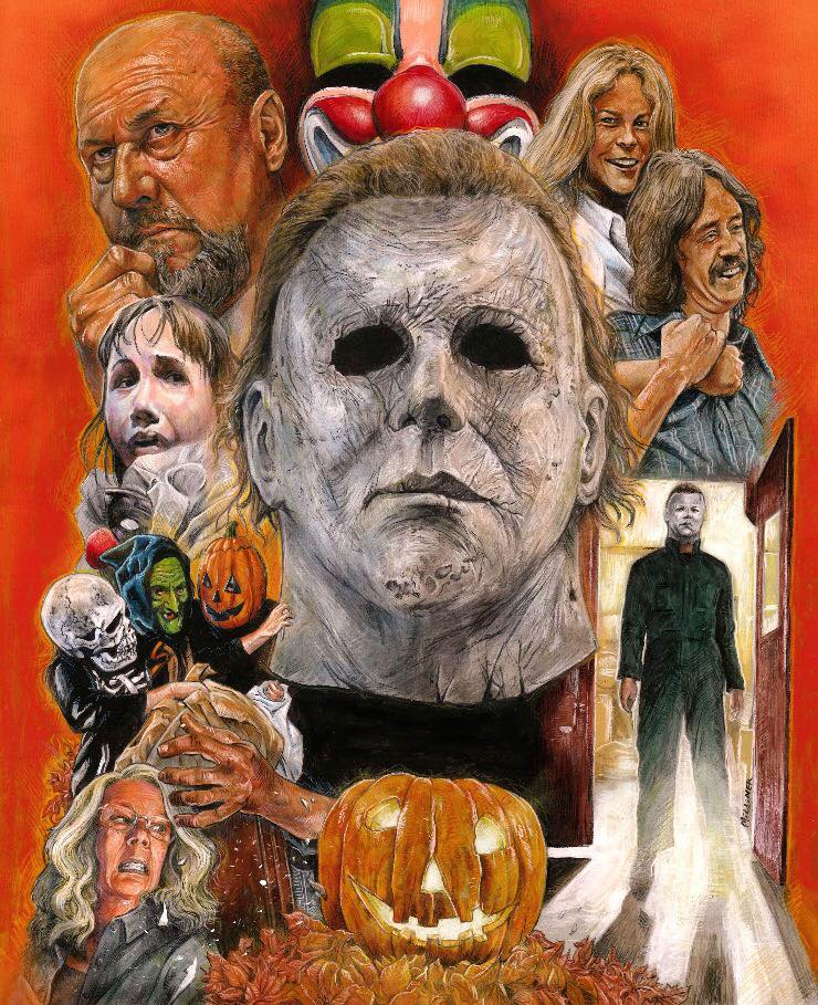
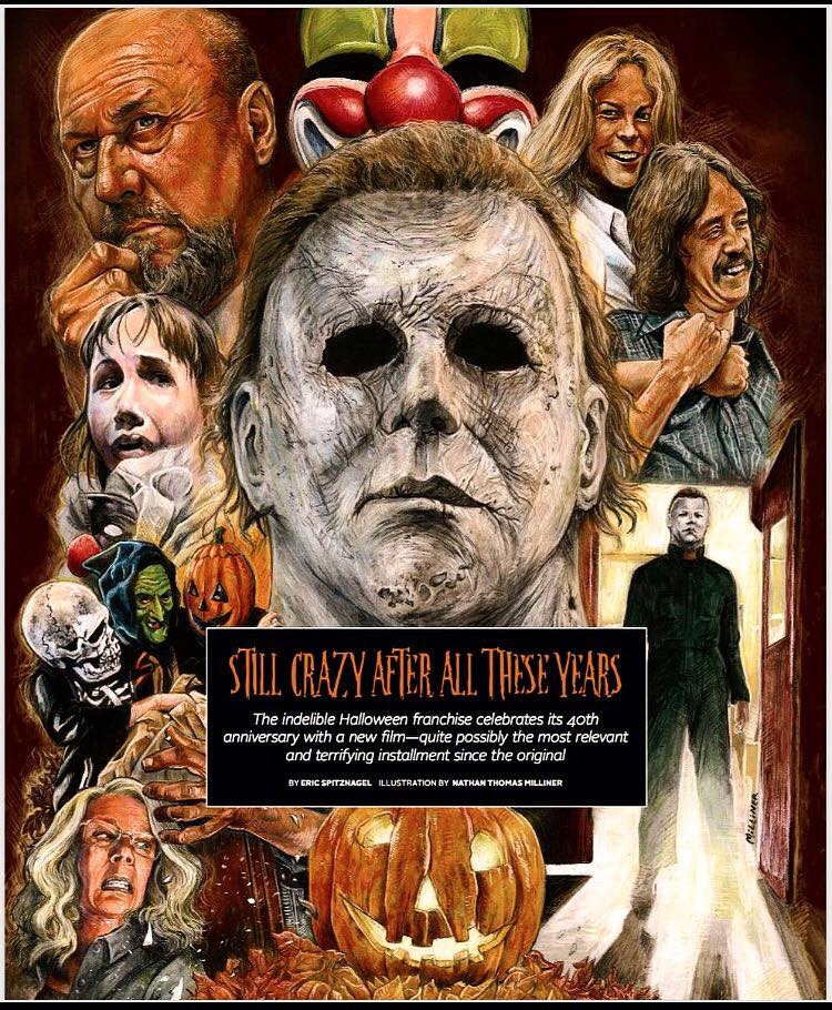
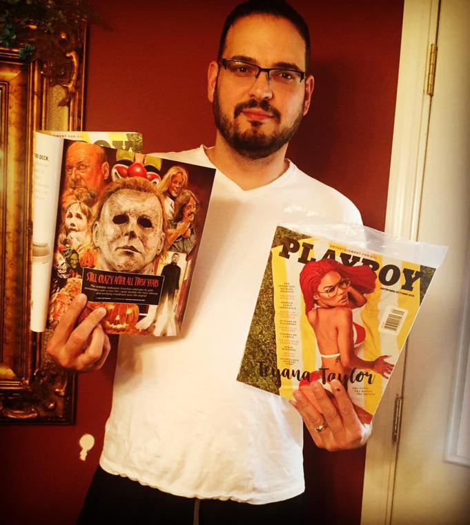
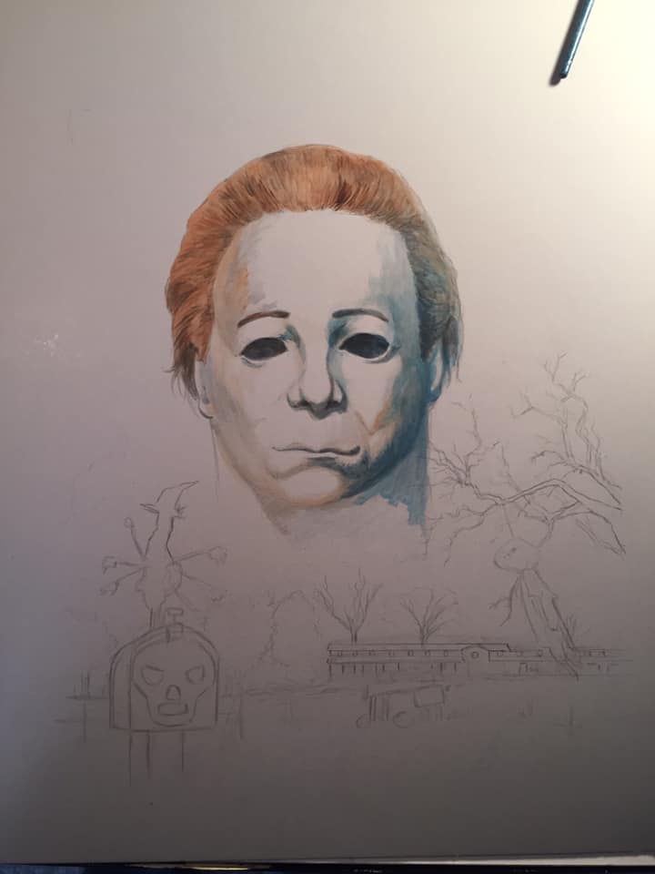
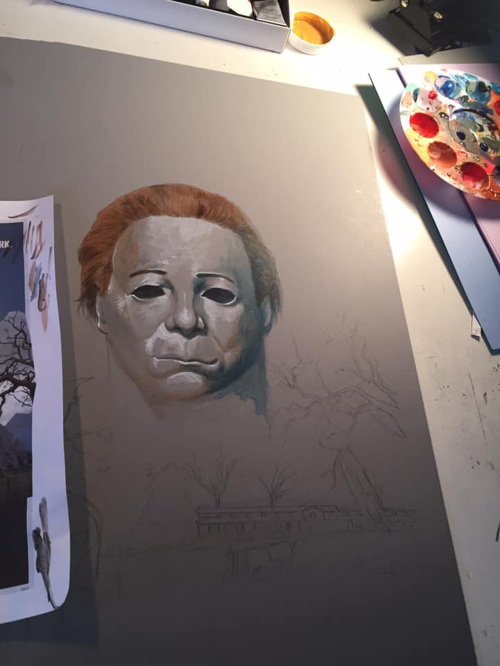
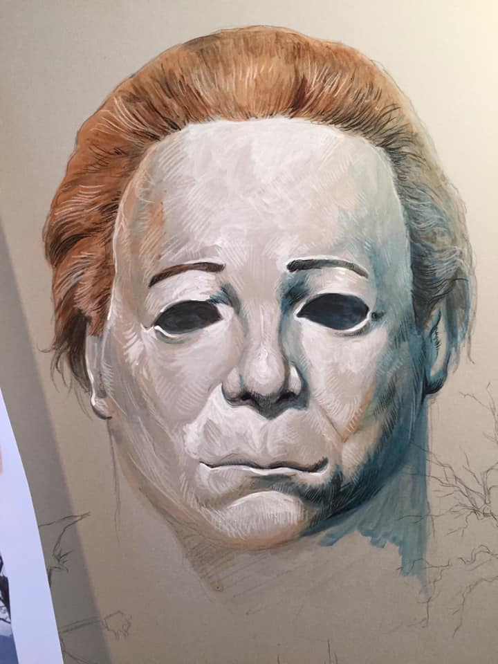
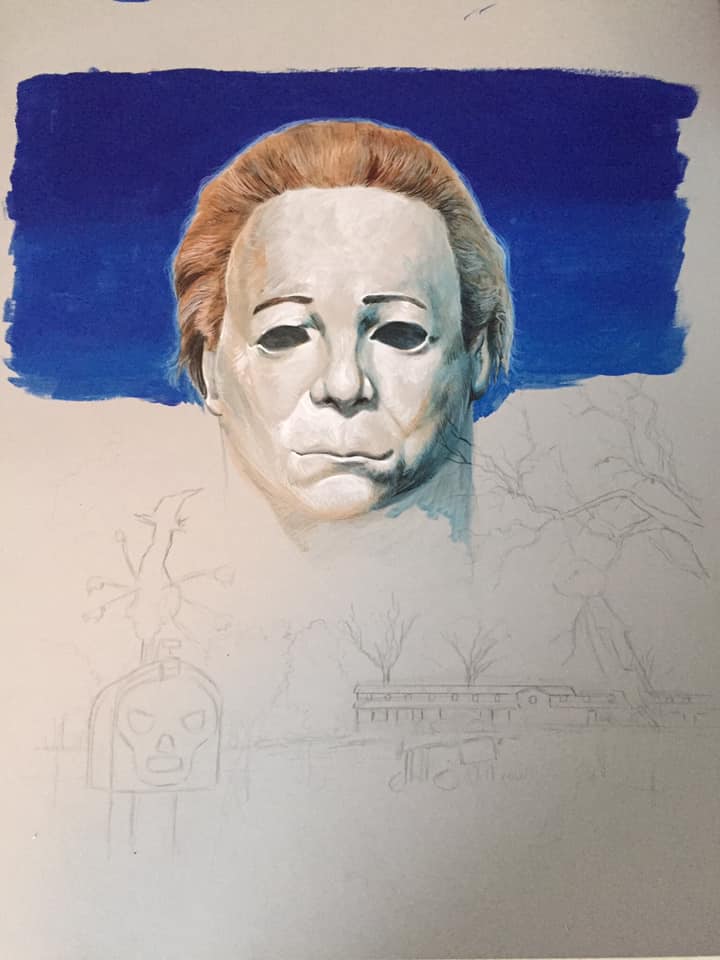
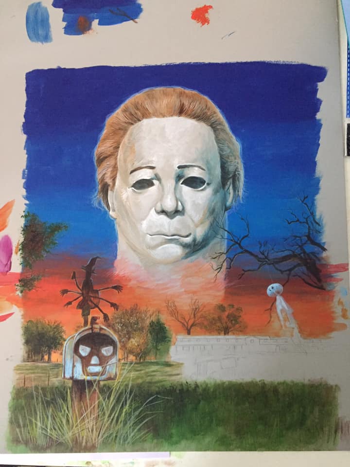
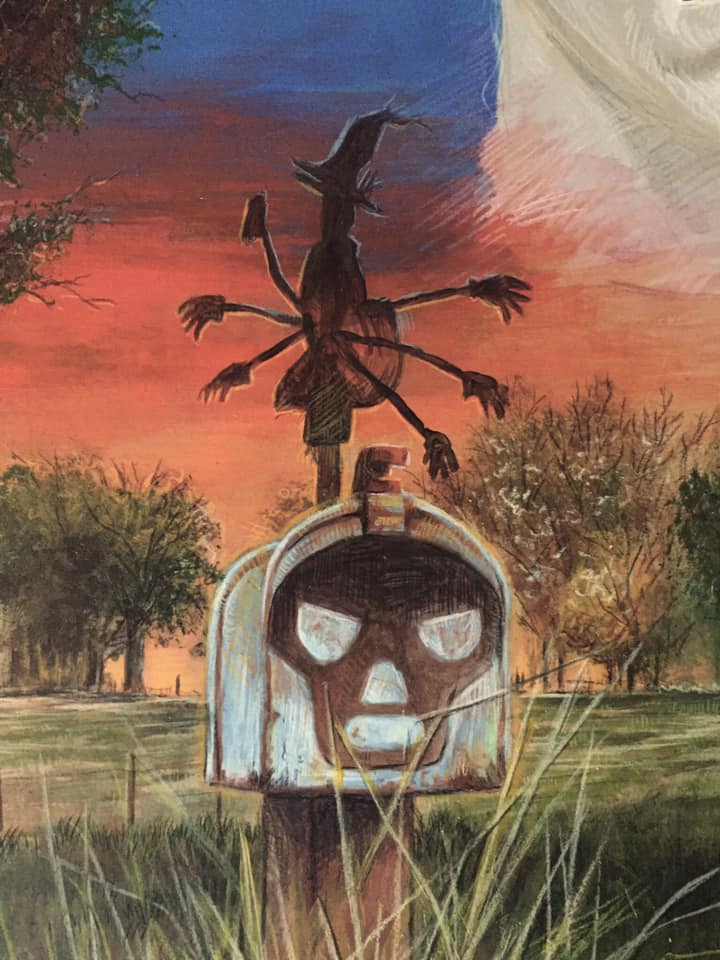
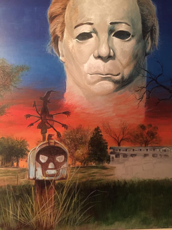
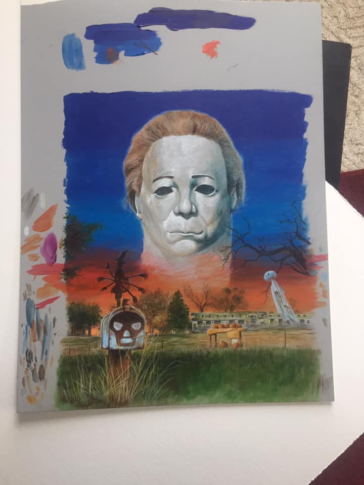
PLAYBOY MAGAZINE HALLOWEEN 40th ARTWORK
Artwork for a Fall issue of Playboy Magazine in 2018 about the Halloween franchise and 2018 film. Acrylic and color pencil on grey toned illustrator board.
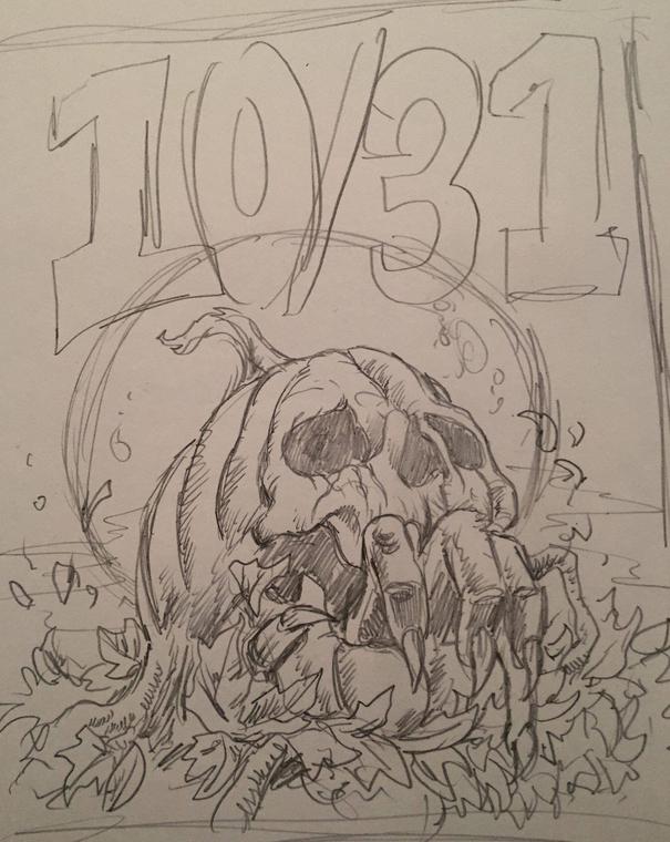
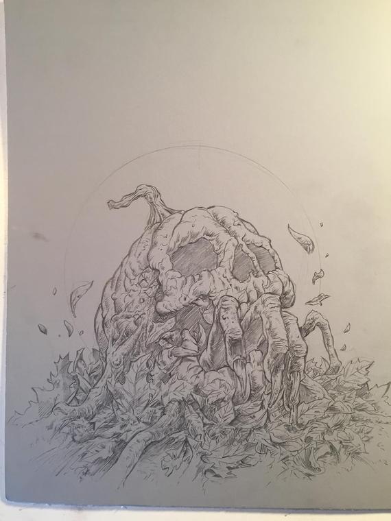
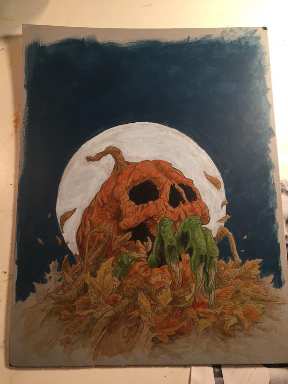
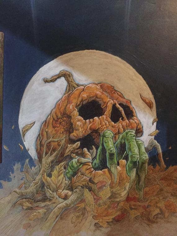
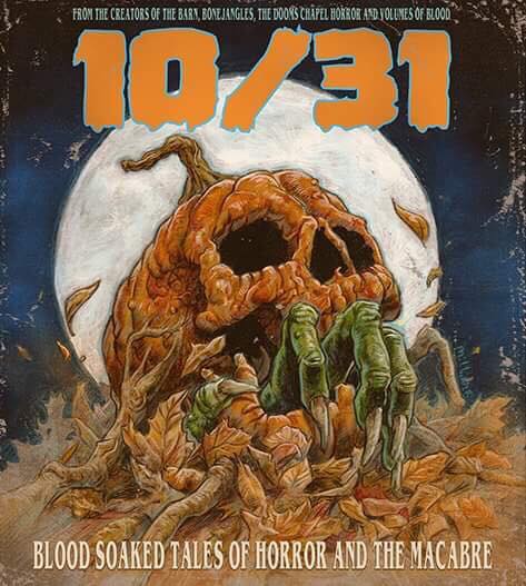
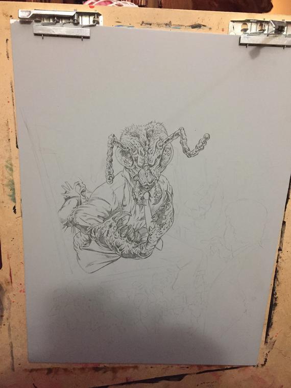
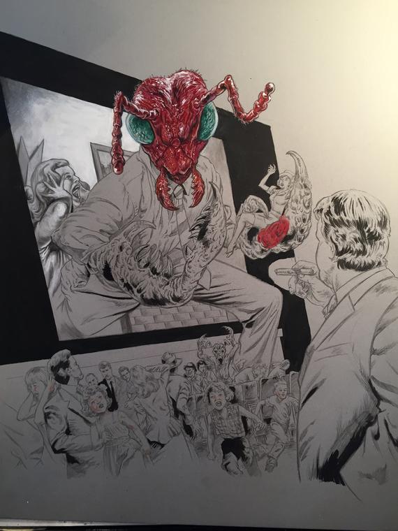
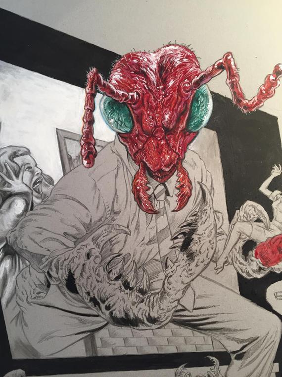
10/31 BLU RAY COVERART
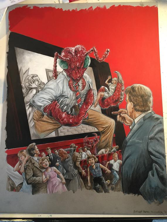
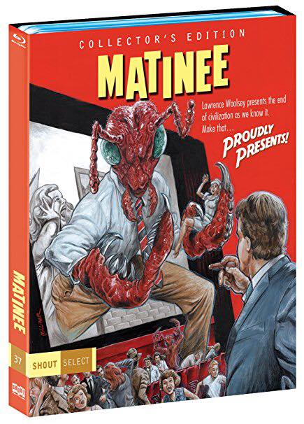
SHOUT SELECT MATINEE BLU RAY ART
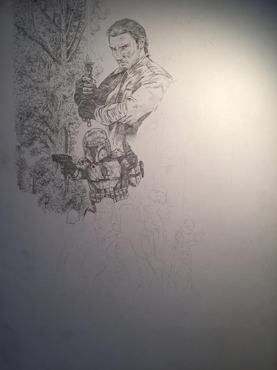
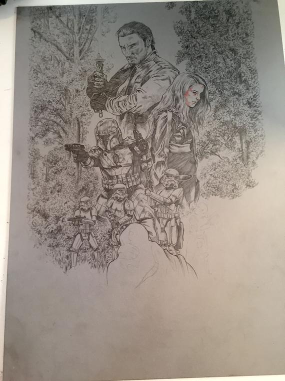
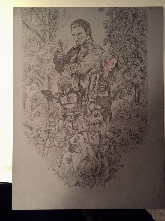
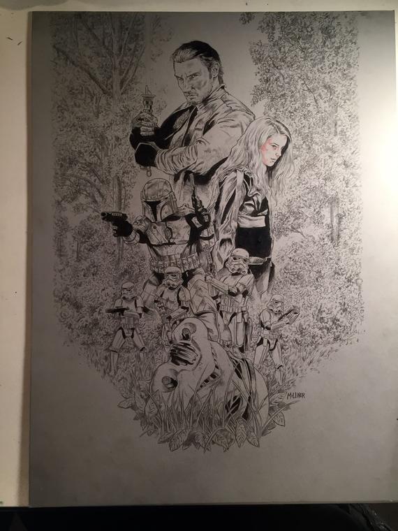
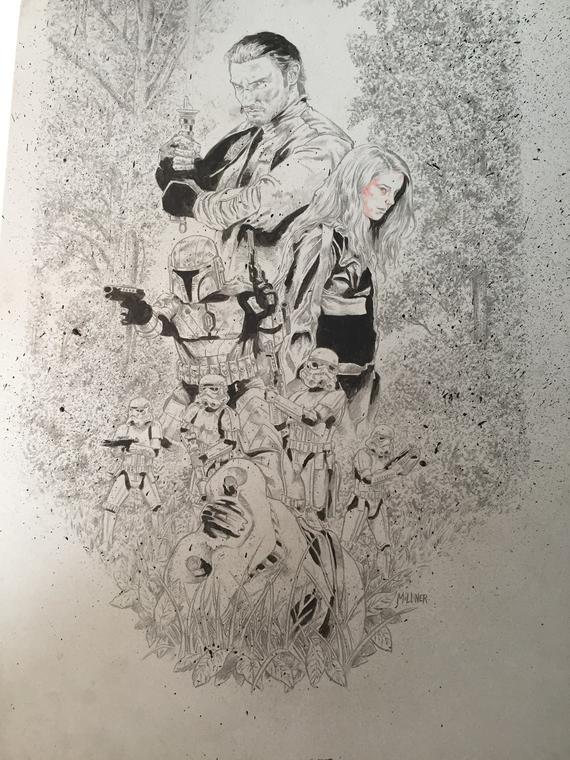
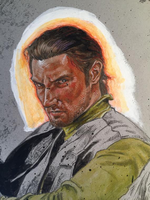
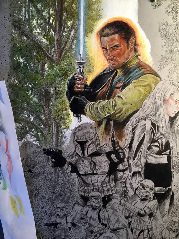
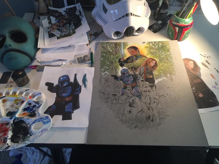
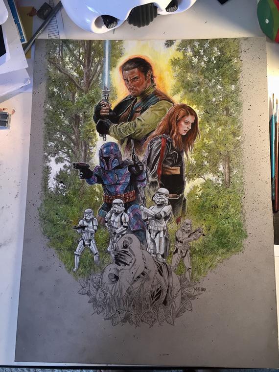
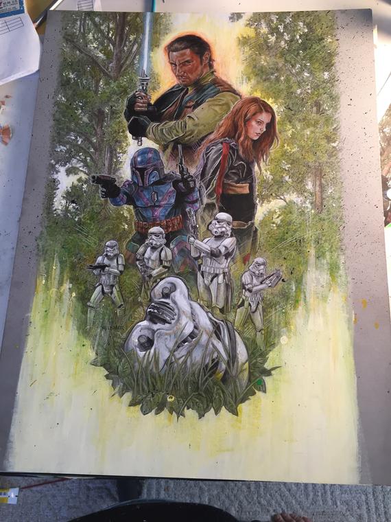
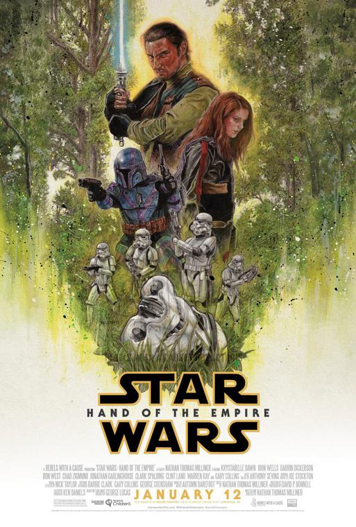
STAR WARS: HAND OF THE EMPIRE poster